 Acknowledging the rising popularity of smart phones and tablet
computers, Adobe has begun to integrate the ability to create mobile
content across its entire Creative Suite and Dreamweaver is no
exception. One feature, which was introduced in Dreamweaver CS5 and
improved in CS5.5, is support for CSS3 Media Queries.
Acknowledging the rising popularity of smart phones and tablet
computers, Adobe has begun to integrate the ability to create mobile
content across its entire Creative Suite and Dreamweaver is no
exception. One feature, which was introduced in Dreamweaver CS5 and
improved in CS5.5, is support for CSS3 Media Queries.
Media Queries allow web designers to create style sheets based upon
the screen size of the device used to view the page. It’s easier to
understand by looking at an example:
@import url("tablet.css") only screen and (min-width:321px) and (max-width:768px);
For the query above the style sheet, tablet.css will be used only for
devices with a screen width between 321 and 768 pixels. Larger and
smaller devices will ignore tablet.css.
Simply stated, media queries make it possible for a web page to use
separate style sheets for phones, tablets and desktops (and even screen
sizes in between). My personal preference is to create a single style
sheet for all devices and then use media queries to overwrite existing
styles and create new, device-specific styles as needed. This also helps
to avoid problems with older browsers that don’t support media queries.
I’ll work through a simple example. Once you understand the concept,
you’ll be able to adapt more challenging designs for mobile use. I’m
going to assume you have a basic understanding of Dreamweaver and
HTML/CSS so I won’t be going into a lot of detail on the steps that
aren’t directly related to creating media queries.
Site Setup
Note: Under Local Info in the Advanced Settings tab of the Site Setup dialog you will notice a field for Site-Wide Media Query file. Ignore it for now. It only works if you have an existing media query file that you want to use for your site.
Create and save a new HTML page.
For this example we’ll work with Dreamweaver’s built-in 2 column
liquid, left sidebar, header and footer layout and save the CSS to a new
file in a folder named css. Using a liquid layout is not necessary but
will allow the layout to maximize screen usage at all sizes.
We’ll make 4 changes to the default layout:
- Change the .container width property to 90% to better use available screen width on small devices.
- Change the .container max-width property to 960px (This isn’t necessary but I don’t like reading very long lines of text).
- Change the .container min-width property to 760px. Note: Since we’ll be setting up rules for smaller screens, this would seem to be unnecessary but it’s useful for older browsers that don’t support media queries. The value of 760px will better accommodate the media queries we’ll be setting up.
- Add a 960px wide image to replace the image placeholder in the header.
Dynamically size an image
The header image creates our first challenge. This image will be too
large to work with mobile devices. We’ll solve this issue by deleting
the image height and width attributes from the html and sizing the image
using CSS.
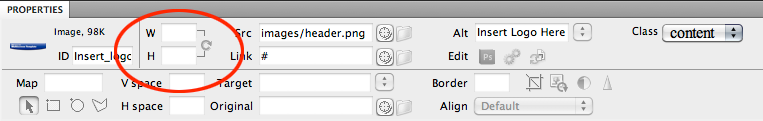
Fig. 1: The Properties Inspector with image selected and the width and height attributes deleted.
- With the image selected delete the height and width attributes in the Properties Inspector (fig. 1 above).
- Next, in the twoColLiqLtHdr.css file, create a new style for the header image:
.header img {
 width:100%;
}
By removing the height and width attributes from the menu tag and
using a percentage value in the CSS width property we cause the image
to resize dynamically as the width of the page changes.
Add media queries and the device specific CSS files.
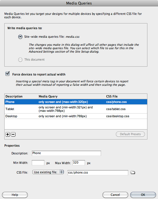
Fig. 2: The Media Queries dialog
- Select the Insert>Media Queries menu item
- In the Media Queries dialog: (fig. 2 above)
- Under Write media queries to click to choose the Site-wide media queries file option (you can choose to save the queries to the current document but saving them to an external file makes them available for all of your site’s files).
- Click the Specify button to create and save your media query file. I saved mine as media.css (you must save the media query file as a .css document) in the same css folder where I saved my main CSS file, twoColLiqLtHdr.css.
- Leave Force devices to report actual width checked.
- In the box below, click the Default Presets button in the lower-right corner. This will define three media queries (for desktops, tablets and phones) but you’ll still need to create and save a CSS file for each of the queries.
- Create the CSS files
-
- Select the Phone query from the list if it’s not already selected.
- Under Properties at the bottom of the dialog:
-
- Accept the defaults for Description and Min and Max Width.
- Choose the Create new file menu option and click the folder icon to create and save your phone-based CSS file. I chose to name my file simply phone.css and saved it in my css folder.
- Repeat the steps above to create CSS files for Tablets and Desktops (as you probably have figured out by now, I called mine tablet.css and desktop.css and saved them in my css folder).Â
- Click OK to dismiss the Media Queries dialog.
Warning: Since we want the
style rules in our media query files to overwrite style rules with the
same names in the twoColLiqLtHdr.css file, the link to the media query
file (media.css) MUST appear after the link to the main
CSS file as shown below. It should happen that way by default but, if
the order is reversed, you’ll need to fix it in the code.
<link href="css/twoColLiqLtHdr.css" rel="stylesheet" type="text/css">
<link href="css/media.css" rel="stylesheet" type="text/css">
Note: After you’ve played with Adobe’s default
media queries for a while you may want to edit them or add more. You can
do that at anytime by choosing the Modify>Media Queries… menu
option.
The tablet.css file
Since the layout I chose was designed for larger screens, I’ll ignore
the desktop.css for now and concentrate on tablets and phones.
Let’s begin with tablets. The first thing we need to change is the
min-width property for our container div. It’s currently set to 760px in
twoColLiqLtHdr.css. Since the tablet media query is used for screens
from 321 to 768 pixels a value of 320 pixels would make more sense.
Unfortunately the min-width property is not supported in Dreamweaver’s
Rule Definition dialog so we’ll need to add the rule directly in the
code of tablet.css.
Container width
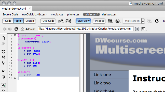
Fig. 3: Split View with tablet.css selected in the Related Files toolbar and displayed in the Code section of the Document window.
- Make sure you are working in Split View and click the tablet.css link in the Related Files list at the top of the Document window. The tablet.css file will be displayed on the left in the code portion of the Split window (fig. 3 above).
- Add this rule to the file:
.container {
 min-width: 320px;
}
You should be able to see the effect of this rule by switching to
Live View and resizing the document window. Notice that the layout will
now resize all the way down to 320px wide.
Tip: You can test your layout at
various common screen sizes by selecting a size from the menu revealed
by clicking on the down arrow at the right of the Multiscreen button in
the Document Toolbar at the top of the Document window (fig. 4 below).
You can also preview the layout at multiple screen resolutions
simultaneously (Fig. 6) by clicking the Multiscreen button itself.
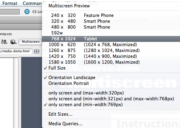
Fig. 4: Selecting a preview screen size from the Multiscreen menu.
Sidebar and menu width
Ignoring the problems with the phone layout for the moment we still
have an issue with the tablet layout. On narrower screens the left
sidebar and menu are very cramped. We can solve that by removing the
sidebar float and making it full width:
.sidebar1 {
 float: none;
 width:100%;
}
Now the sidebar appears above the main content rather than to its left.
Nav button width
Full width the nav buttons are rather wide. We can arrange them in
two columns by floating the list items left and setting their width to
50%:
ul.nav li {
 float:left;
 width:50%;
}
Content width
Finally, the width of the content div is 80%. We need it to fill the
full width of our layout so we’ll add this final rule to tablet.css:
.content {
 width: 100%;
}
Our finished tablet.css looks like this:
@charset "utf-8";
.container {
 min-width: 320px;
}
.sidebar1 {
 float: none;
 width:100%;
}
ul.nav li {
 float:left;
 width:50%;
}
.content {
 width: 100%;
 }
And on a 480 pixel wide device our layout now looks like Fig. 5 below.
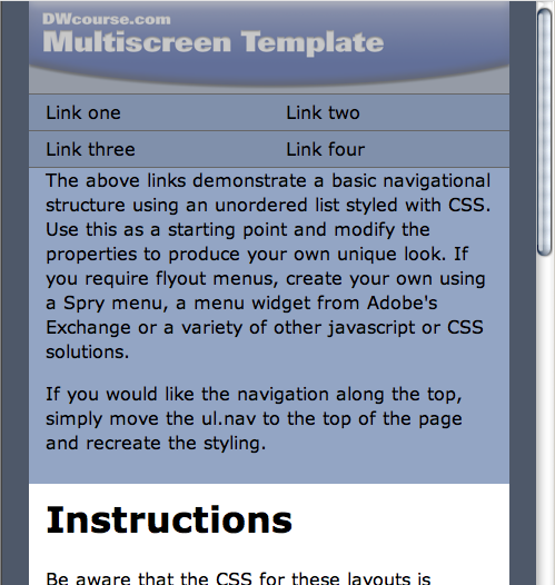
Fig. 5: The page previewed at 480 pixels wide showing the effects of the tablet.css style sheet.
The phone.css file
We need similar rules for phone.css with the a couple changes: The
min-width of the layout will be 200px, which should accommodate even
pretty dumb smart phones. And we’ll let the buttons be the full width of
the layout. So our phone.css file will look like this:
@charset "utf-8";
.container {
 min-width: 200px;
}
.sidebar1 {
 float: none;
 width:100%;
}
.content {
 width: 100%;
}
The finished page
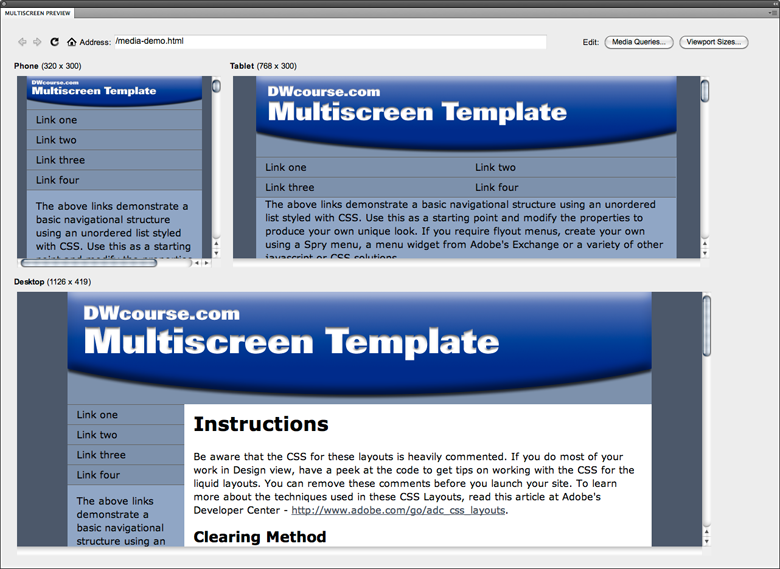
Fig. 6: A multiscreen preview of the page showing the different layouts for phone, tablet and desktop devices.
Figure 6 shows the Multiscreen preview of our customized layout. With
just a few simple style rules we’ve created a layout that comfortably
accommodates mobile devices and still looks good on a desktop computer.
Of course if this was an actual project rather than a simple demo
we’d probably want to customize headline sizes and other features for
maximum readability on smaller screens but, now that you understand the
basics of CSS media queries, that should be a snap.
Good luck creating your own mobile friendly site. If you’d like to
experiment with a more elaborate project you can download my free Dreamweaver Multiscreen template. And, if you have any questions about this tutorial, ask them in the Dreamweaver Club forum and I’ll be sure to follow up.
Hi. I want to record several of one's posts and thank
ReplyDeleteyou to
My homepage - car insurance for women